Garmin Connect - acquire data
For more than a year I’ve been using Garmin Smartwatch it collects lots of data some of them a pretty valuable for me.
So I started to figure out how can I visualize them better than what Garmin offers, it’s not bad at all, but
extensively using monitoring tools was a kind of temptation to work the same ;) After a quick research,
I found GarminDB, a pretty nice tool to grab data, store them in SQLite
and visualize in Jupyter Notebook. SQLite can be used as ie. a data source in Grafana, but I’m not a big fan of
simulating time-series databases with SQL commands. So the workaround was to export the data from SQLite into
let’s say… InfluxDB, because it supports importing data from CSV.
When you grab all the data using GarminDB you can start exporting them to CSV:
$ cd ~/HealthData/DBs
$ sqlite3 garmin.db
SQLite version 3.36.0 2021-06-18 18:58:49
Enter ".help" for usage hints.
sqlite> .tables
_attributes       device_info_view  resting_hr        weight
attributes        devices           sleep
daily_summary     files             sleep_events
device_info       files_view        stress
sqlite> .headers on
sqlite> .mode csv
sqlite> .output rhr.csv
sqlite> select * from resting_hr order by day;
sqlite> .quit
than we can start working with the InfluxDB instance:
$ docker run -d -v $(pwd):/data -p 127.0.0.1:8086:8086 --name  influxdb influxdb
# do initial configuration via http://127.0.0.1:8086:
# create organization
# create bucket
# get admin the api token
$ docker exec -ti influxdb bash
root@babc99c1ab2c:/# export INFLUX_TOKEN=<your_token>
root@babc99c1ab2c:/# influx write -f /data/rhr.csv -o test -b garmin --header "#constant measurement,rhr" --header "#datatype dateTime:2006-01-02,double"
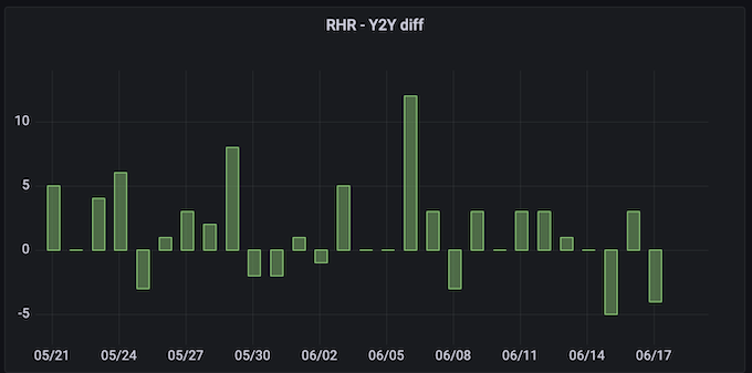
Now you’ve imported your resting heart rate into InfluxDB to garmin bucket. So we can start exploring data
using Flux language. I’m pretty new with Flux, so I was surprised by the verbosity and how many functions it
presents. The goal for me was the prepare the difference year-to-year in resting heart rate, to visualize
the data you can use built-in explorer or use Grafana. I choose the second option with the final query for last 30 days:
current = from(bucket: "garmin")
  |> range(start: -30d)
  |> filter(fn: (r) => r["_measurement"] == "rhr")

past = from(bucket: "garmin")
  |> range(start: -395d, stop: -365d)
  |> filter(fn: (r) => r["_measurement"] == "rhr")
  |> timeShift(duration: 365d)

join(tables: {curr: current, past: past}, on: ["_time"])
    |> map(fn: (r) => ({_time: r._time, _value: r._value_curr - r._value_past}))
Effect:
Pretty nice alternative to visualize your health data, of course, there are a lot of opportunities to make importing much smoother.
powered by Hugo and Noteworthy theme